Helsinki tackled the city’s personality and deepest identity in the Brand New Helsinki project, which was launched in 2015. This was the first project focusing on the city’s brand. The project charted the strengths and weaknesses of Helsinki and created understanding of the aspects that Helsinki wanted to be globally known for in the future.
Soon after the completion of the brand concept, Helsinki launched a process to create a new visual identity.
The goal of the branding project was to boost the reputation and position of Helsinki in international competition as well as to develop the City of Helsinki operating culture so that the City would be a solution-oriented partner for residents. Design methods were widely utilized in the creation of both the brand concept and the new visual identity.
The voices of residents heard in the project
The Brand New Helsinki project consisted of several stages that utilized service design. These stages openly engaged the entire city from residents to City of Helsinki employees to businesses in the creation of the brand concept. The project partner for the City of Helsinki was the creative business design agency Kuudes Helsinki.
The work started with a review of various surveys on Helsinki and competing cities. Survey analyses, specialist interviews and the views of both residents and visitors were used to produce experience maps. The maps served as a basis to formulate four MyHelsinki 2020 conceptual ideas: Helsinki is a city that (1) gives people more time to enjoy their lives, (2) energizes people with both an urban pulse and tranquility, (3) is a place where to build a better world together with others, and (3) is the best city in the world to fulfil oneself.
Residents were invited to evaluate and to work on the conceptual ideas and on Helsinki stories created on the basis of these ideas in workshops, at events and on the project’s website. Altogether thousands of people participated in the Brand New Helsinki project.
A city of people, acts and encounters that make an impact
The results of the work generated the brand concept One Hel of an Impact. The concept reflects the Helsinki mindset that challenges people to think big and encourages them to perform exceptional acts. Helsinki is a city in transition. Helsinki is a functional and original city of contrasts. Helsinki will be known in the future for people, acts and encounters that make an impact.
The cornerstones of Helsinki’s first brand concept
- Helsinki in transition
- Functional Helsinki
- Helsinki of contrasts
- Original Helsinki
Visual identity created by honouring the design heritage of Helsinki
The vision of Helsinki crystallized in the brand concept required a uniform visual identity to support it. The City of Helsinki had not had a uniform visual identity before, but different City departments and projects had their own logos and identities.
The goal of the development was to create a bold and dynamic, non-bureaucratic visual identity in accordance with the brand concept.
Design played a powerful role in the development of the visual identity, starting from early project stages. Process procurement was carried out by emphasizing a qualitative evaluation of partner candidates instead of a mere comparison of costs. As a result, the strategic brand design agency Werklig was chosen as the project partner.
The new visual identity was produced on a tight schedule. In cooperation with Werklig, the City developed a design process model for the project – a sprint model, which enabled the project to complete the work efficiently in only four months.
According to the model, there was a preparatory group comprising representatives of various sections of the City organization. They met regularly with Werklig to consider visual proposals. A steering group comprising leading City officials met once a month, and their efficient decision-making drove the visual identity development forward.
The members of the preparatory group became internal “City ambassadors” as the work progressed. Their mission was to ensure that the new visual identity was adopted throughout the City organization.
The meticulous design of the new visual identity mirrored the values of Helsinki, which include honouring the city’s design heritage. For example, the traditional Helsinki coat of arms was retained in the shape of the new logo. Furthermore, the colour palette of the new identity was based on the easily recognizable colours of the Helsinki cityscape.
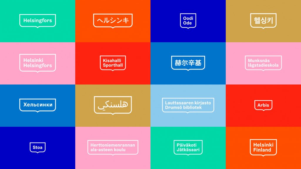
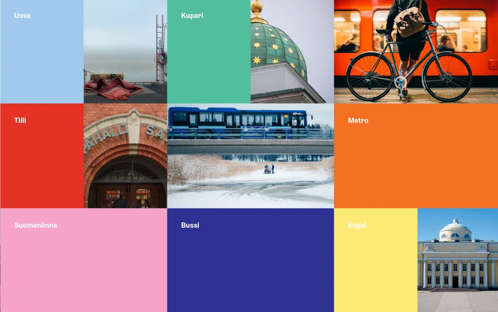
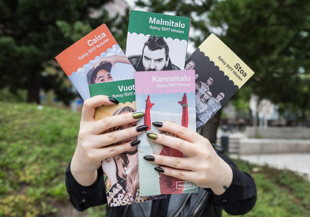
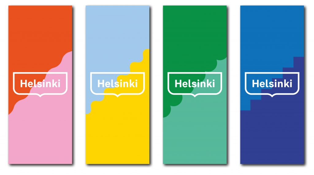
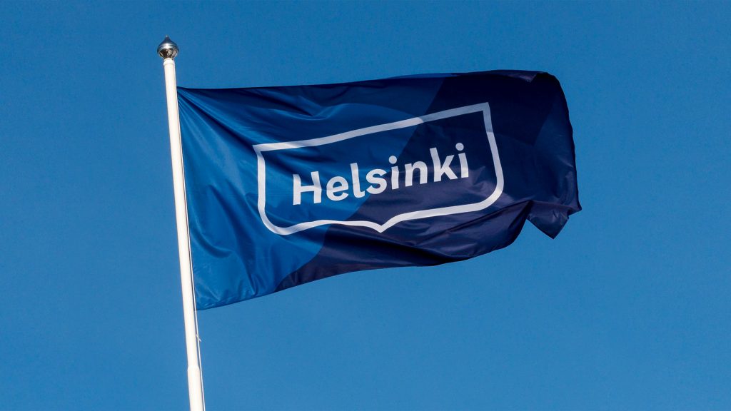


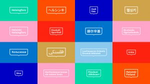
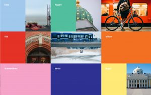

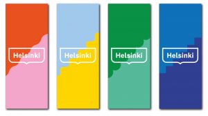

The new visual identity brings the City of Helsinki closer to people
The creation of the new visual identity put people into the heart of the project. The goal was to turn the attention of the City of Helsinki organization away from internal operations and considerations outward to better serve residents, entrepreneurs and visitors.
Helsinki adopted the new visual identity in the spring of 2017 in connection with the reform of the City governance system and organization. The objective of both the organizational reform and the new visual identity was to convey an increasingly comprehensible and uniform message about Helsinki.
The new visual identity has affected internal City operations by unifying the broad range of operations. The uniform visual identity has helped to clarify to residents all the great many ways in which the City serves them. At the same time, the City has come closer to residents. According to a survey conducted by the consultancy Miltton in December 2019, the reform of Helsinki’s visual identity had been successful. The new logo was well recognized by Helsinki residents and especially by younger people. The logo was actively associated with positive feelings
Pictures: Werklig, City of Helsinki, Juhana Hurtig, Aleksi Poutanen, Carl Bergman, Jussi Hellsten

